
Smart-dumb Phones
Client: Telefonica Innovation
User Research I Service Design I UX Design
Barcelona, Spain
Problem Definition
Many smartphone users in Spain face two major issues - storage and performance. Among the two, users are more concerned about the storage problem as they assume that the lack of storage is what causes poor performance on their smartphones. Therefore, finding a solution for the storage problem is a top priority for them. The ultimate goal of this project is to be able to fully virtualize apps and run them on a cloud, which would be considered a success.
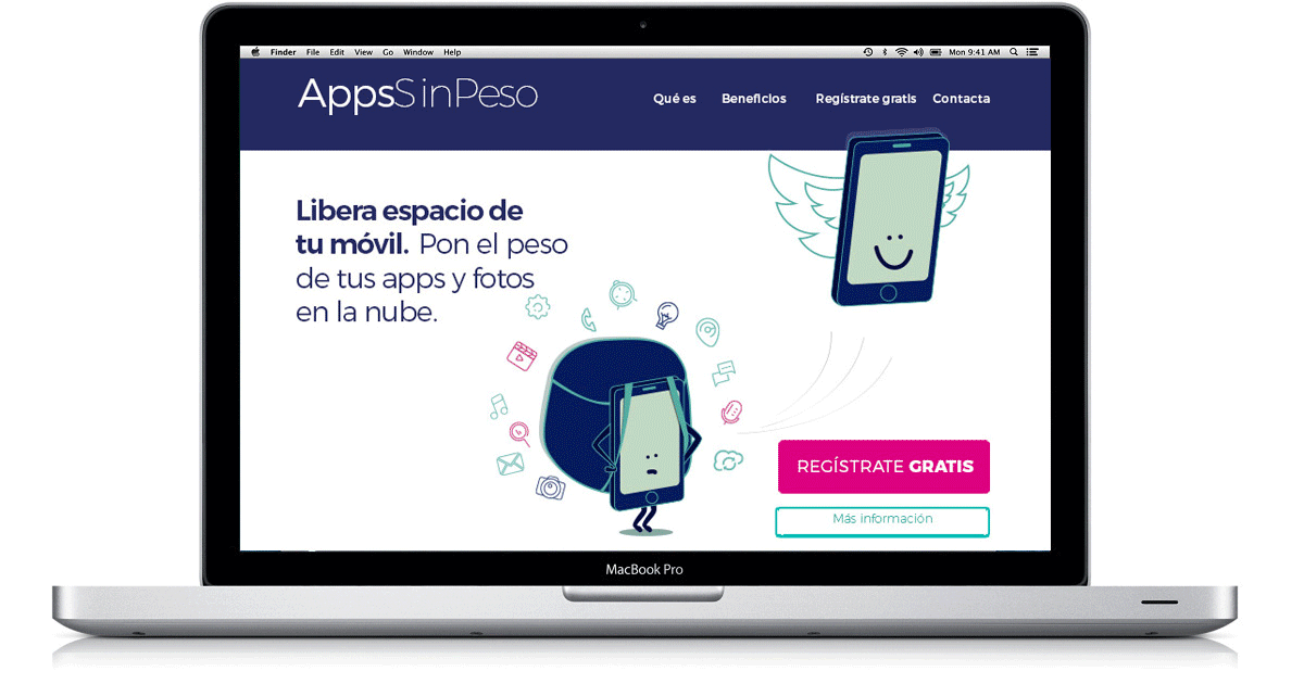
A service that enables feature phones to run apps in the cloud
The website explains the service to users
Audience
The intended audience for this project was individuals residing in Catalonia, Spain, who are cellphone users and fall between the age group of 28 and 50. Our target was people with prior knowledge of cloud computing, which would help them understand the topics we would address.
Team
We were a small team of six working as a startup within Telefonica Innovation - a Project Manager, two Engineers, a Psychologist, and myself.
My role
I was responsible for conducting user research to gather insights and design a service based on those insights.
Constraints
Initially, the Smart-Dumb Phones project was meant to provide solutions for feature phones. However, after conducting user research, we discovered that the feature phone market was dwindling as smartphones became more affordable. Additionally, most feature phones were used as secondary phones or by older users who preferred not to switch to smartphones. As a result, we had to shift our research focus towards smartphone users.
Design Process
During the design process, I worked on refining an existing draft of a landing page. At first, we had only basic information about our target audience, but after conducting interviews, we gained more insights that helped us improve the design. My role was to update the landing page with the proposed service based on the research findings. One of the most significant changes we made was to use illustrations to explain the benefits of our service. We also added multiple payment plans to the prototype and simulated the app's experience on a mobile phone. Additionally, we developed a video that showcased the users' pain points and demonstrated how our service could benefit them in a clear and accessible way.

Quantitative Validation
Experiment 1. Measure interest
Was the problem/need recognized by users/customers?
Quantitative research:
Two landing pages were presented, one for improving storage and one for performance.
Outcome:
Both pages received the same number of visits, with different associated keywords, which were 1053 and 964. As a result, we can conclude that both problems are equally important. However, we analyzed the statistics and found that the click-through rate (CTR) for "Movil Rapido" was 27%, while for AppsSinPeso.com was 40%. Therefore, we can say that "space" has the best "problem-solution" fit, as it has a more straightforward business model and a more consistent message.
Problem to be solved: need to free up space in my phone

Experiment 2. Measure the willingness to try
Goal: Measure % of people who subscribe (offering e-mail) to a free route plan.
Design guidelines:
Emphasis on articulating the value (“it isn’t only your pictures but apps” that take space). Main pieces of communication:
Video + benefit – descriptions.
Convey that the user controls what to upload (UI – key features visualization)
Make it tangible – real (offer real plans and the actual UI experience)
Reduce barriers to try (1 option is free, and the other two offer 2 months free before payment)


Outcome
38% of Subscribers were “Paid Subscribers” (even when a free option was given)
Average conversion rate – 2,35%,
Top 25% - 5,31%,
Top 10% – 11.45%
Subscribers: users who clicked one of the proposed plans and subscribed by giving + decided to give their email to receive the product once it’s ready.

Experiment 3. Measure willingness to pay
Goal: Measure % of people who subscribe to one of the payment routes and click “obtener” to follow the payment process.
Main changes with the previous experiment:
We used one landing page that included three different subscription models. There was not a free option. Instead, the three options offered a three-month free trial model. Users would then need to add their credit card information and would be charged only after the trial ended.
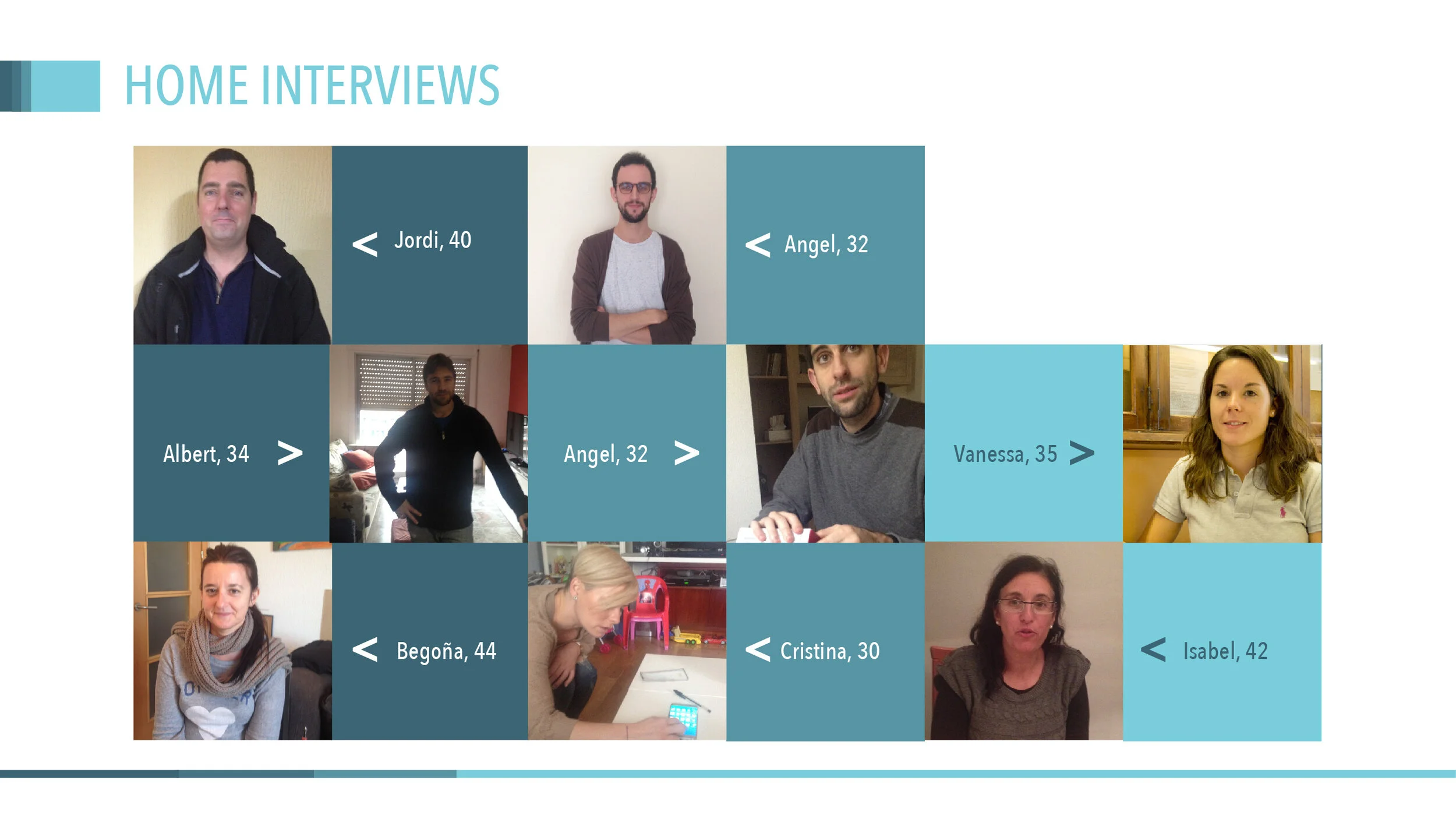
Experiment 4. Qualitative validation
Research approach: At-home in-depth interviews (1,5 hours each) with two sections: exploratory open conversation and reactions on the landing page, alternative product features, and alternatives of framing payment models.
We conducted before the 1st experiment so that the insights obtained would inform the landing page design and type of payment model.
Key learnings
Translating a complex technical solution into graphics can be challenging. Since every element of the service we presented to the users was intangible, comprehending it wasn't straightforward.
The daily usage of a smartphone seems to be evident, but when you need to understand the users who aren’t used to using smartphones, the perspective of the research changes.
Clear communication is crucial to helping users understand how your product will solve their problems and persuade them to buy it.
Using illustrations on landing pages is a powerful way to engage users and help them understand problems more easily.
Even as a prototype, our service garnered significant interest and successful metrics, indicating potential for trial and purchase.